Developers love using React UI component libraries to streamline development and ensure design consistency.
Below is a curated list of the most popular React UI component libraries, ordered from the most to the least used, based on GitHub stars and npm weekly downloads in March 2025.
React UI component libraries
Here’s an overview of the most used React UI component libraries:
| Library | Repository | Package | GitHub stars | npm downloads |
|---|---|---|---|---|
| Tailwind UI | GitHub | npm | 86.4k | 14.8M |
| Material UI ✨ | GitHub | npm | 95.1k | 4.1M |
| Chakra UI | GitHub | npm | 38.7k | 590k |
| Ant Design | GitHub | npm | 94k | 1.4M |
| Fluent UI | GitHub | npm | 19k | 1.3M |
| Mantine | GitHub | npm | 28.1k | 500k |
| Magic UI ✨ | GitHub | npm | 15.3k | 1k |
| React Suite | GitHub | npm | 8.5k | 77.5k |
| Hero UI | GitHub | npm | 23.5k | 68.8k |
| PrimeReact | GitHub | npm | 7.5k | 156.5k |
| Ariakit | GitHub | npm | 8k | 129.2k |
| Shadcn UI | GitHub | npm | 82.9k | 61.2k |
| React-Bootstrap | GitHub | npm | 22.5k | 1M |
| Base Web | GitHub | npm | 8.8k | 24.3k |
| Grommet | GitHub | npm | 8.4k | 30k |
| Radix UI | GitHub | npm | 16.7k | 10.3M |
| Headless UI | GitHub | npm | 27k | 2M |
| Semantic UI React | GitHub | npm | 13.5k | 213k |
| Blueprint | GitHub | npm | 20.9k | 120k |
| Evergreen UI | GitHub | npm | 12.4k | 9.8k |
| Geist UI | GitHub | npm | 4.4k | 1.2k |
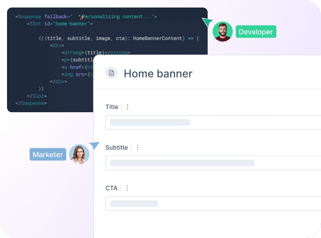
Croct helps product teams scale experimentation and personalization without over-relying on developers.
Tailwind UI
| Website | Repository | Package | GitHub stars | Contributors | Projects | npm downloads |
|---|---|---|---|---|---|---|
| 🔗 Link | 🔗 Link | 🔗 Link | 86.4k | 305 | 13.5M | 14.8M |
Tailwind UI is a premium UI component library built by the creators of Tailwind CSS, offering a rich collection of beautifully designed components that are fully customizable. It follows a utility-first approach, allowing developers to style components directly using Tailwind classes.
With 78k GitHub stars and over 8 million weekly downloads, Tailwind UI is one of the most widely adopted UI kits in the industry. It is used by startups and large enterprises alike to create visually stunning interfaces with minimal CSS overhead.
Material UI (MUI)
| Website | Repository | Package | GitHub stars | Contributors | Projects | npm downloads |
|---|---|---|---|---|---|---|
| 🔗 Link | 🔗 Link | 🔗 Link | 95.1k | 3,012 | 1.4M | 4.1M |
MUI is one of the most popular React UI libraries, providing a complete set of Material Design components. Its highly customizable theming system and extensive documentation make it a favorite for developers building modern web applications.
With over 95k stars on GitHub and 4.1 million weekly downloads, MUI is trusted by major companies like Spotify, Amazon, and Netflix.
Check out these templates if you want to use Material UI components integrated with a dynamic component CMS that includes built-in personalization and AB testing.
Chakra UI
| Website | Repository | Package | GitHub stars | Contributors | Projects | npm downloads |
|---|---|---|---|---|---|---|
| 🔗 Link | 🔗 Link | 🔗 Link | 38.7k | 693 | 366k | 590k |
Chakra UI is a flexible and accessible component library designed for modern web applications. It supports style props, dark mode, and easy theme customization, making it an excellent choice for developers prioritizing flexibility.
It has a growing community with 38.7k GitHub stars and 533k weekly downloads.
Ant Design
| Website | Repository | Package | GitHub stars | Contributors | Projects | npm downloads |
|---|---|---|---|---|---|---|
| 🔗 Link | 🔗 Link | 🔗 Link | 94k | 2251 | 707k | 1.4M |
Ant Design is a comprehensive UI framework developed by Alibaba that is widely used in enterprise applications. It offers a wide range of polished components, internationalization, and accessibility features.
With 94k GitHub stars and 1.1 million weekly downloads, it is a go-to choice for large-scale web applications.
Fluent UI
| Website | Repository | Package | GitHub stars | Contributors | Projects | npm downloads |
|---|---|---|---|---|---|---|
| 🔗 Link | 🔗 Link | 🔗 Link | 19k | 872 | 16.7k | 1.3M |
Fluent UI is Microsoft's official UI library for building web applications with a consistent design across Windows applications.
Mantine
| Website | Repository | Package | GitHub stars | Contributors | Projects | npm downloads |
|---|---|---|---|---|---|---|
| 🔗 Link | 🔗 Link | 🔗 Link | 28.1k | 623 | 82.7k | 500k |
Mantine is a fast-growing React component library that provides over 100 components, hooks, and utilities. It is highly customizable and supports server-side rendering (SSR).
With 28.1k GitHub stars and 500k weekly downloads, Mantine is becoming a go-to library for developers looking for a modern UI toolkit.
Magic UI
Magic UI is a creative React component library that provides elegant and customizable UI elements tailored for modern web applications. Magic UI is particularly known for its animations and micro-interactions, which enhance the user experience without requiring additional dependencies.
Despite being relatively new, Magic UI has already gained significant attention, with more than 15k GitHub stars. It focuses on providing a smooth developer experience while maintaining performance and accessibility.
Check out these templates if you want to use Magic UI components integrated with a dynamic component CMS that includes built-in personalization and AB testing.
React Suite
React Suite is a component library designed for enterprise systems, offering a comprehensive set of components with built-in themes and responsiveness.
Hero UI
| Website | Repository | Package | GitHub stars | Contributors | Projects | npm downloads |
|---|---|---|---|---|---|---|
| 🔗 Link | 🔗 Link | 🔗 Link | 23.5k | 236 | 70.4k | 68.8k |
Hero UI (previously Next UI) is a modern UI library designed for performance and ease of use with Next.js. It provides styled components that are optimized for server-side rendering (SSR).
PrimeReact
| Website | Repository | Package | GitHub stars | Contributors | Projects | npm downloads |
|---|---|---|---|---|---|---|
| 🔗 Link | 🔗 Link | 🔗 Link | 7.5k | 320 | 47k | 156.5k |
PrimeReact is part of the PrimeFaces ecosystem, offering a rich set of UI components with themes, templates, and accessibility support. It is used by large enterprises like Mercedes, Volkswagen, and Intel, making it a strong contender in enterprise development.
Ariakit
Ariakit (previously Reakit) is an advanced UI library that focuses on accessibility and flexibility. It provides hooks and components that enhance UI interactivity.
Shadcn UI
Shadcn UI is an innovative UI toolkit that allows developers to install components directly into their projects instead of relying on a centralized package.
It has gained popularity quickly, with 66k GitHub stars, making it one of the fastest-growing UI component libraries.
React-Bootstrap
| Website | Repository | Package | GitHub stars | Contributors | Projects | npm downloads |
|---|---|---|---|---|---|---|
| 🔗 Link | 🔗 Link | 🔗 Link | 22.5k | 476 | 1.4M | 1M |
React-Bootstrap is a popular UI framework that brings Bootstrap components to React while removing the dependency on jQuery. It is fully compatible with Bootstrap themes, widely used in enterprise applications, and remains a solid choice for developers who prefer Bootstrap’s styling.
Base Web
Base Web is a design system created by Uber that features a robust set of components with customizable themes and high accessibility.
Grommet
| Website | Repository | Package | GitHub stars | Contributors | Projects | npm downloads |
|---|---|---|---|---|---|---|
| 🔗 Link | 🔗 Link | 🔗 Link | 8.4k | 384 | 10.4k | 30k |
Grommet is a design system optimized for accessibility and responsiveness. It is widely used in enterprise applications and provides a clean, modern design aesthetic.
Radix UI
Radix UI is a set of low-level UI primitives that are accessible and easily customized. Thanks to its flexibility and composability, it is widely used in modern applications, including by companies like Vercel and Supabase.
Headless UI
| Website | Repository | Package | GitHub stars | Contributors | Projects | npm downloads |
|---|---|---|---|---|---|---|
| 🔗 Link | 🔗 Link | 🔗 Link | 27k | 95 | 6.9k | 1.8M |
Headless UI is a collection of unstyled, fully accessible UI components built by the creators of Tailwind CSS. It allows developers to implement components while maintaining complete control over styling and is a top choice for Tailwind CSS users.
Semantic UI React
Semantic UI React implements the Semantic UI framework for React, offering clean and intuitive design patterns. Though not as actively maintained as others, it remains a strong choice for projects requiring Semantic UI's aesthetics.
Blueprint
| Website | Repository | Package | GitHub stars | Contributors | Projects | npm downloads |
|---|---|---|---|---|---|---|
| 🔗 Link | 🔗 Link | 🔗 Link | 20.9k | 417 | 17.9k | 120k |
Blueprint is an advanced UI toolkit designed for data-heavy applications. Developed by Palantir, it is a preferred choice for enterprise-grade dashboards and applications.
Evergreen UI
Evergreen UI is a React component library designed by Segment, offering a set of flexible and customizable UI elements. It is widely used for creating dashboards and admin panels.
Geist UI
Geist UI is a minimal and elegant UI library inspired by Vercel’s design principles. It is optimized for modern, lightweight applications.
How to choose?
React UI component libraries are a game-changer for developers, allowing them to build feature-rich interfaces efficiently. Whether you're looking for a fully styled solution like MUI or Ant Design, a utility-focused library like Radix UI or Headless UI, or a lightweight framework like geist-ui, there's an option for every use case.
Choosing the right UI library depends on factors such as your design needs, customization flexibility, performance considerations, and integration with other tools.
Fluent UI, PrimeReact, or Blueprint may be ideal if you're building enterprise applications. If you favor modern, sleek designs, Shadcn UI or Next UI might be your go-to choice.