If you are a React developer looking to implement a dialog or modal in your application, this guide is for you.
It reviews the top libraries of 2025, like react-modal, highlighting features like responsiveness, accessibility, and customization to help you pick the right tool for your projects.

React UI component libraries that offer modal dialog
Although not specific to the modal component, some React UI component libraries also provide this element.
React modal dialog specific libraries
Here’s an overview of some libraries ordered from the most to the least used based on GitHub stars and npm weekly downloads in March 2025.
| Library | Repo | Package | GitHub stars | npm downloads |
|---|---|---|---|---|
| react-modal | GitHub | npm | 7.4k | 1.7M |
| react-responsive-modal | GitHub | npm | 607 | 51.8k |
| react-modal-promise | GitHub | npm | 65 | 31.6k |
| react-aria-modal | GitHub | npm | 1k | 29k |
| react-modal-image | GitHub | npm | 201 | 23.6k |
| styled-react-modal | GitHub | npm | 213 | 16k |
| react-modal-hook | GitHub | npm | 251 | 26.6k |
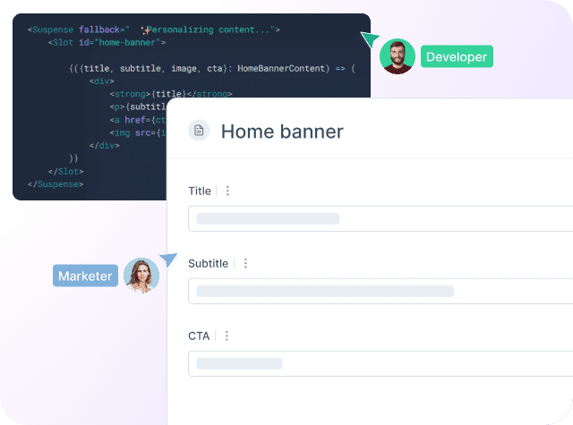
Croct helps product teams scale experimentation and personalization without over-relying on developers.
react-modal
react-modal is one of the most popular and versatile React libraries for creating accessible modals. It provides a flexible foundation for building custom modal components with features like focus management, accessibility attributes, and customizable styling. Its main differential is its adherence to accessibility standards, ensuring that modals are usable by everyone.
react-responsive-modal
react-responsive-modal is designed to create modals that adapt to different screen sizes, ensuring a consistent user experience across devices. It supports customization through CSS and inline styles, offering flexibility in design. Its responsiveness and ease of use make it a favorite for developers targeting multiple devices.
react-modal-promise
react-modal-promise provides a way to handle modal interactions using promises, making it easier to manage asynchronous operations such as form submissions or confirmations. It simplifies the process of waiting for user input within a modal before proceeding with further actions. Its promise-based approach makes it stand out for handling complex workflows.
react-aria-modal
react-aria-modal focuses on creating accessible modals with full ARIA support, ensuring compliance with accessibility standards. It provides features like focus trapping and keyboard navigation, making modals usable for people with disabilities. Its commitment to accessibility makes it a top choice for inclusive web development.
react-modal-image
react-modal-image is specifically designed to display images in a modal, providing a smooth and responsive user experience. It supports zooming, panning, and other image manipulation features. Its focus on image display makes it ideal for showcasing galleries or detailed product images.
styled-react-modal
styled-react-modal combines the power of styled components with modal functionality, allowing for highly customizable and themeable modals. It makes it easy to create visually consistent modals that match your application's design system. Its integration with styled components provides a seamless styling experience.
react-modal-hook
react-modal-hook offers a simple and elegant way to manage modal state using React hooks. It simplifies the process of opening and closing modals with minimal boilerplate code. Its hook-based API makes it easy to integrate into functional components.
How to choose?
When selecting a React modal library for your project, consider the following factors to ensure it meets your requirements:
- Accessibility: ensure the library supports accessibility features like focus management, ARIA attributes, and keyboard navigation. Libraries like react-modal are known for their strong accessibility support.
- Customization: if you need to style the modal extensively, choose a library that offers flexible customization options. react-modal and styled-react-modal allow for inline styles and integration with CSS-in-JS libraries.
- Responsiveness: for applications targeting multiple devices, libraries like react-responsive-modal ensure modals adapt seamlessly to different screen sizes.
- Ease of Use: libraries with minimal setup and intuitive APIs, such as react-modal-hook and react-modal-promise, simplify integration and reduce development time.
- Advanced Features: if your project requires specific functionalities like promise-based interactions or image handling, opt for specialized libraries like react-modal-promise or react-modal-image.
- Community and Support: choose libraries with active communities and regular updates, such as react-modal, to ensure long-term reliability and access to resources.
By evaluating these criteria, you can select the React modal library that best aligns with your project’s needs.
Happy coding!